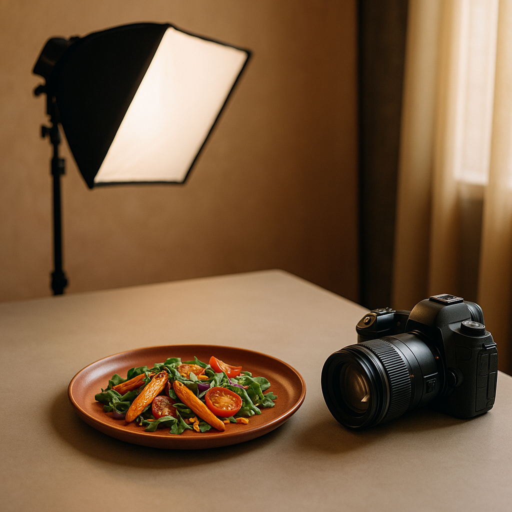
Hungry customers scroll fast. Thumbnails are tiny, decision windows are shorter, and your image has to do the work of a server’s table-side pitch. That’s where color food photography stands apart: the right palette makes texture pop, frames freshness, and nudges appetite. Below, you’ll find a practical, platform-ready guide to dialing in color so your dishes win the tap—without heavy retouching or guesswork. FoodFix is built to make that consistency effortless, so your listings stay sharp across Uber Eats, Glovo, and Just Eat.
Why color matters on delivery marketplaces
Food decisions on delivery apps happen at a glance. Color is the fastest visual cue the brain processes, and it telegraphs flavor, temperature, and freshness instantly.
- Appetite signals: Warm reds and oranges suggest heat and savoriness. Greens promise freshness and crunch. Cool blues rarely occur in food and can suppress appetite if overused.
- Trust and freshness: Clean whites and neutrals communicate hygiene and clarity. Muddy, grayish casts hint at staleness.
- Platform context: App UIs often use light or neutral backgrounds; images that deliver controlled warmth and distinct color separation tend to read better in small thumbnails.
- Differentiation: When your competitors all show beige bowls, a crisp acid-green herb or ruby pickled onion can separate your listing.
Industry reports indicate that warm hues and vivid accents are commonly associated with higher appetite appeal, but balance is key: over-saturation reads artificial and can backfire.
Color food photography fundamentals
Before props and plating, lock in the basics:
- Hue: The actual color family (red, green, yellow). Decide your hero hue per dish—tomato red for pasta, charred umber for steak, jade for herbs.
- Saturation: Intensity of color. Push just enough to convey freshness; let neutrals keep the frame believable.
- Luminance: Brightness of a color. Helpful for separating similar hues (e.g., distinguishing golden fries from a tan bun).
- Temperature: Warm vs. cool. Most craveable food leans warm, but use cool notes (greens, purples) as contrast.
- Contrast: Light/dark and complementary colors. High local contrast (salt on steak, oil shine on noodles) builds texture.
- Harmony: Analogous (neighboring hues) feel cohesive; complementary (opposites) pop. Use one strategy intentionally per image.
- White balance: Keep whites actually white. A neutral baseline makes every accent color truer and more edible.
Build a conversion-focused palette for your menu
Think like a brand designer. Curate a small set of color moves you can repeat:
- Pick a signature accent: Cilantro green, chili red, or lemon yellow. Sprinkle it consistently across hero dishes to create immediate recognition in the feed.
- Use appetizing neutrals: Matte charcoal plates, parchment, or light gray backgrounds make foods brighter without blowing out highlights.
- Control the beige: Carbs are often tan. Add micro-pops (herbs, pickles, citrus zest) to prevent a flat, monochrome look.
- Respect cuisine cues: Curry and tandoori pop against cool slates; sushi sings on soft gray or charcoal; pizza thrives with basil green and blistered red.
- Avoid color conflicts: A purple napkin behind a medium-rare steak can make meat read gray. Keep props supportive, not competitive.
Tip: Build a simple style board. Photograph a lemon wedge, basil, and a neutral plate under your standard light. If they look natural, your dishes will too.
Lighting that protects your palette
Light is the first color decision you make.
- Stay consistent: Use a single light source to avoid mixed color casts. Daylight-balanced LEDs or indirect window light are safe bets.
- Diffuse to preserve saturation: Soft light deepens color without harsh glare. A cheap diffuser or thin curtain works.
- Bounce with neutral cards: White or gray bounce cards lift shadows without shifting hue. Avoid colored walls as reflectors.
- Set white balance once: Custom white balance on set reduces time “fixing” color later and keeps your menu uniform.
- Mind speculars: Controlled highlights make oils and glazes look juicy; uncontrolled hotspots blow out color detail.
Framing, contrast, and platform thumbnails
Apps crop hard and compress thumbnails. Design for small screens:
- Compose tight: Fill the frame with the most colorful third of the dish.
- Add negative space: A touch of clean background improves readability and contrast.
- Use color blocking: Place a high-chroma accent (basil, chili, pomegranate) at a power point where the eye lands first.
- Shape clarity: Overhead shots simplify complex plates; 45° angles flatter layered sandwiches and burgers.
- Batch test: Export a grid of thumbnails at app-sized dimensions and compare which images stay legible.
Mini case study: from beige bowls to craveable color
A neighborhood Mediterranean bowl shop struggled with flat, beige images: hummus, rice, chicken—delicious in person, lifeless on-screen. They rebuilt their color approach in three steps:
1) Palette: They committed to a warm base (golden rice, toasted pitas) with a cool-accent trio—parsley green, pickled-onion magenta, and lemon yellow. 2) Light: They switched to a single daylight LED with diffusion and set custom white balance using a gray card. 3) Framing: They cropped tighter and placed a lemon wedge at the top-left power point for pop.
Within a few menu cycles, they reported clearer textures in thumbnails, more taps on bowls featuring the magenta-green contrast, and faster sell-outs of those SKUs on busy nights. While results vary and many factors drive conversion, industry observations suggest that deliberate accent colors and cleaner white balance often improve first-glance appeal.
A practical color workflow checklist
Use this quick loop each shoot day:
- Decide the hero hue and the supporting accent.
- Lock white balance with a gray card.
- Place one neutral and one warm prop; remove anything that steals attention.
- Diffuse your key light; kill mixed lighting.
- Add micro-contrast: salt flakes, oil brush, or a spritz of water on greens.
- Plate for color separation (don’t bury herbs under sauces).
- Shoot overhead and 45°; export small previews and compare.
- Nudge saturation modestly; protect skin tones and bread tones from going orange.
- Calibrate across dishes so the menu reads like a set, not a collage.
How FoodFix makes color effortless
Even with a solid approach, busy services leave little time for testing. FoodFix is the practical shortcut: it replaces traditional food photographers for menus and on-demand marketplaces, giving you consistent color, controlled contrast, and platform-ready crops without the logistics or the billable-hour creep. With FoodFix, you get AI-styled sets that respect cuisine cues, preserve appetizing warmth, and keep whites neutral so accents sing.
- Fast and predictable: 99-second turnaround for updates and variants.
- Simple pricing: €1.5 per shot; Pro plan at €45/month for 30 photos; or a €225 full-menu package when you need everything aligned.
- Built for delivery apps: Options tailored for Glovo, Uber Eats, and Just Eat thumbnails, so your palette stays punchy at small sizes.
If you’re ready to standardize appetizing color across your listings without extra staff or studio gear, start with FoodFix and keep your menu visually consistent week after week.
FAQ
What background color works best for most food?
Neutral grays and soft off-whites are the safest. They keep whites truly white, reduce color cast, and let your hero accents (greens, reds, yellows) carry appetite signals. Dark charcoals can work for grilled items or bright salads that need contrast.
How saturated should my images be on mobile?
Aim for natural-plus. Slightly elevated saturation helps thumbnails, but avoid neon tones that look artificial. If beige foods push orange or greens turn electric, you’ve gone too far—dial back and protect skin tones, breads, and cheeses.
Are there “bad” colors for food images?
Pure blues are tricky because they’re uncommon in natural foods and can dull appetite. Use cool tones mainly as accents (ceramic, linens) rather than on the food itself. Also avoid heavy magentas in meats, which can read undercooked.
Is white balance more important than color grading?
Yes. Nail white balance first to keep neutrals clean and colors honest. Then make small, consistent grading moves (contrast, saturation, selective color) across the set so the whole menu feels coherent.
Should I match brand colors in the food or just the props?
Let the food lead. Use brand colors in props or backgrounds sparingly so they don’t fight with natural appetizing hues. A small branded accent (napkin stripe, liner) is enough—keep the dish’s fresh colors as the hero.